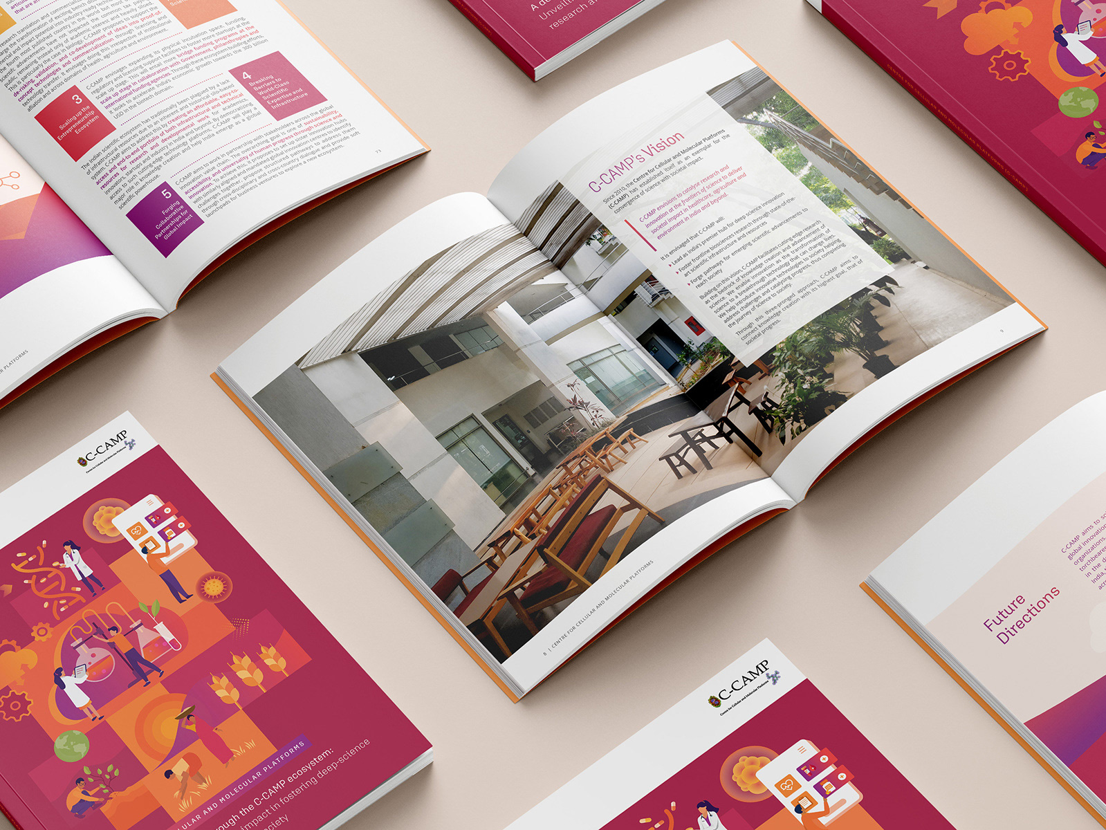

The National Centre for Biological Sciences (NCBS) in Bangalore, Karnataka, is a research centre specialising in biological research. It is a part of the Tata Institute of Fundamental Research (TIFR) under the Department of Atomic Energy of the Government of India.
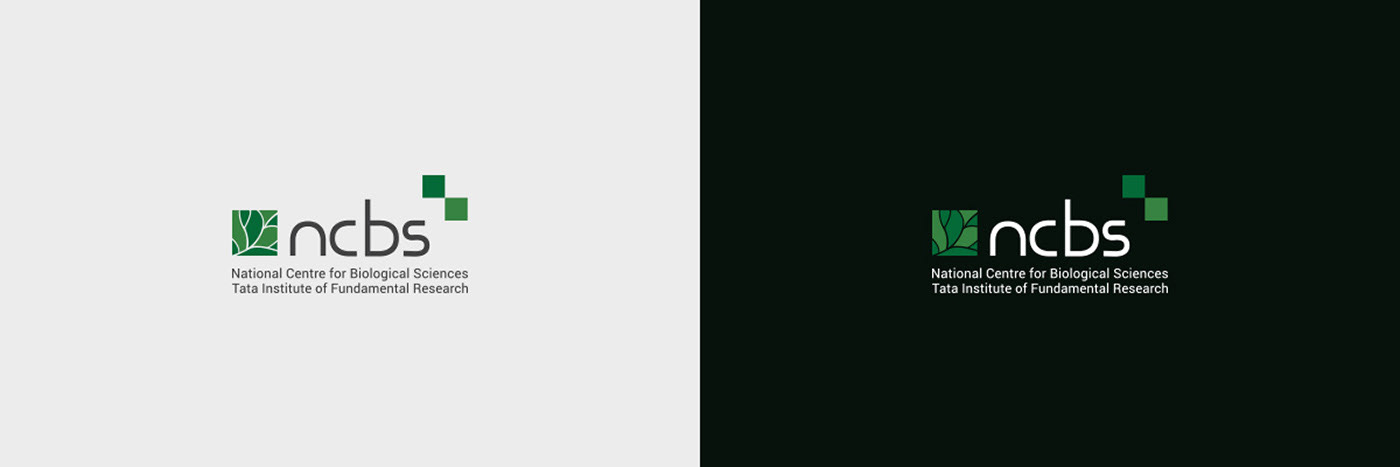
NCBS LOGO (Old Version)

The NCBS logo encompasses a beautiful leaf section inside a square shape and two square elements on the other side. The logo is distinct, relates to life through its color palette and elements, and the font is new-age and memorable.
Note: I do not have the original designer's information for attribution.
Identifying the problem areas

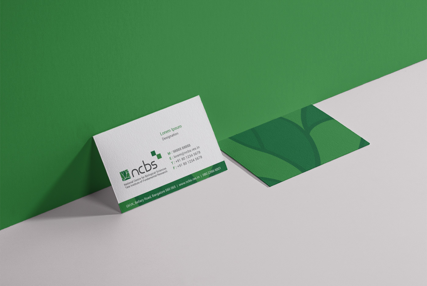
Along with the two institute names, the logo unit included the postal and web addresses, which made up for a chunk of text under the logo symbol. Some of this information could be removed.
There were gaps between the text lines which made the logo unit take up more space in height and the text formed an irregular shape with the logo symbol.
Other versions of the old logo

There were no brand guidelines as such in place so there were many different ways that the logo was being used across different collateral, depending upon the user.
The requirement was to develop a modified version of the logo and to devise a set of standards for the logo usage across all digital and print media.
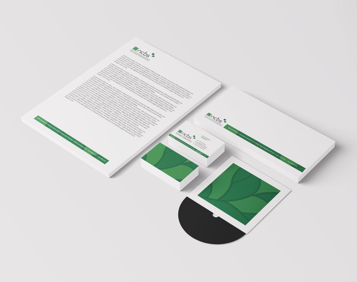
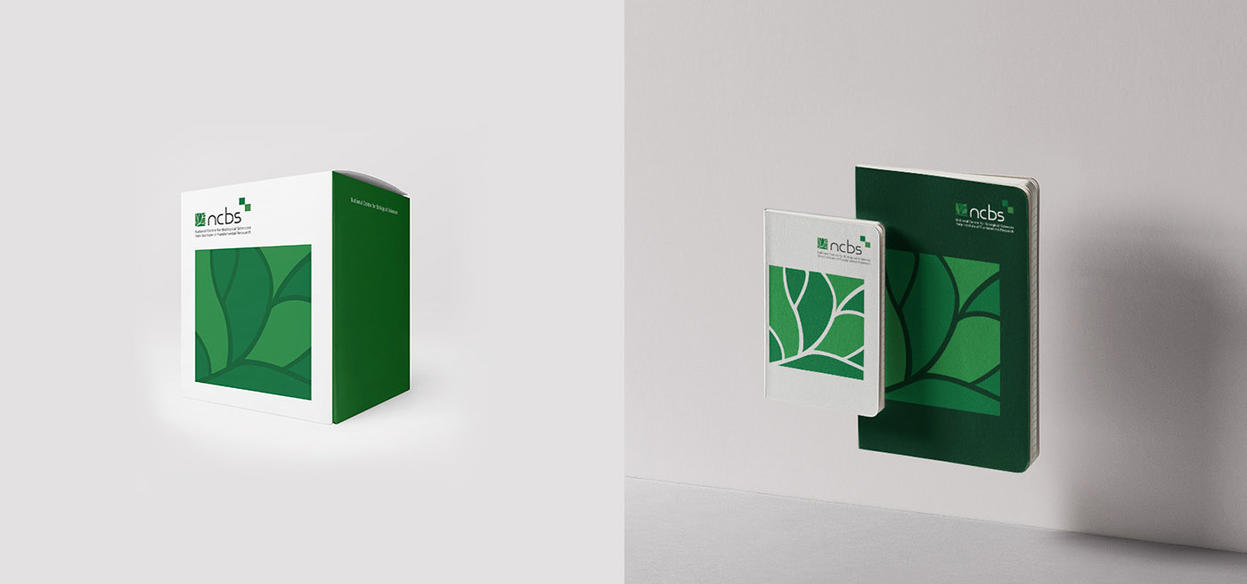
REVISED LOGO & BRAND COLLATERAL DESIGN
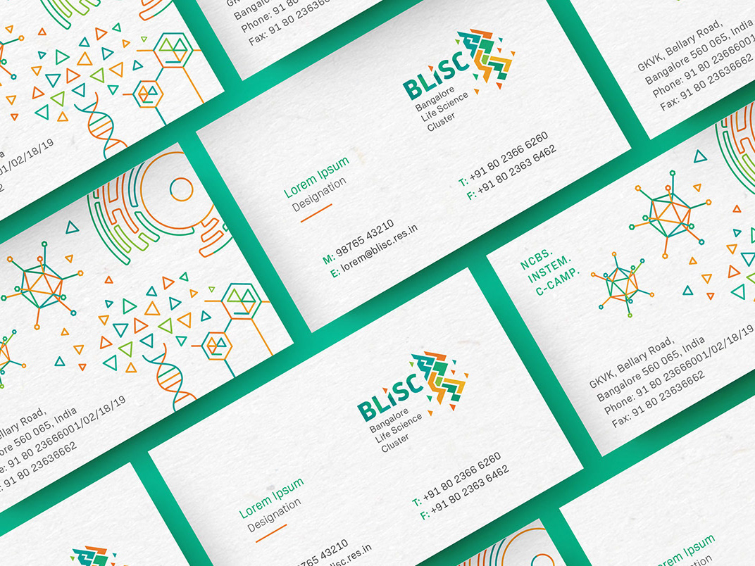
NCBS and inStem
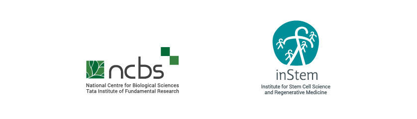
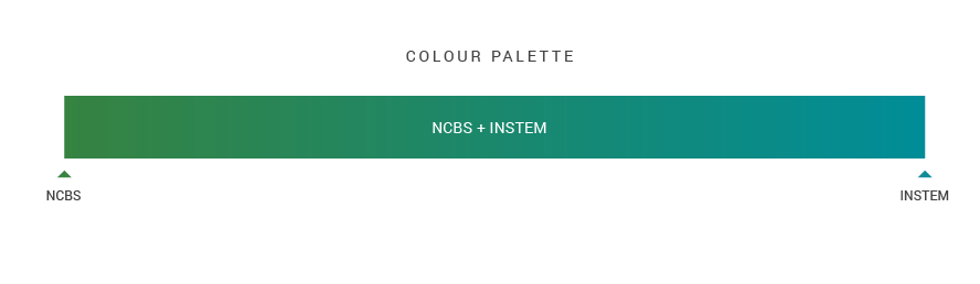
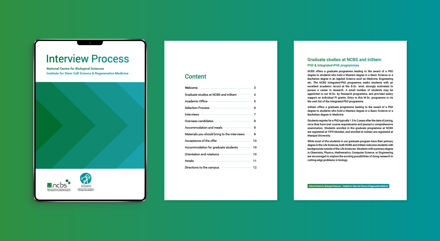
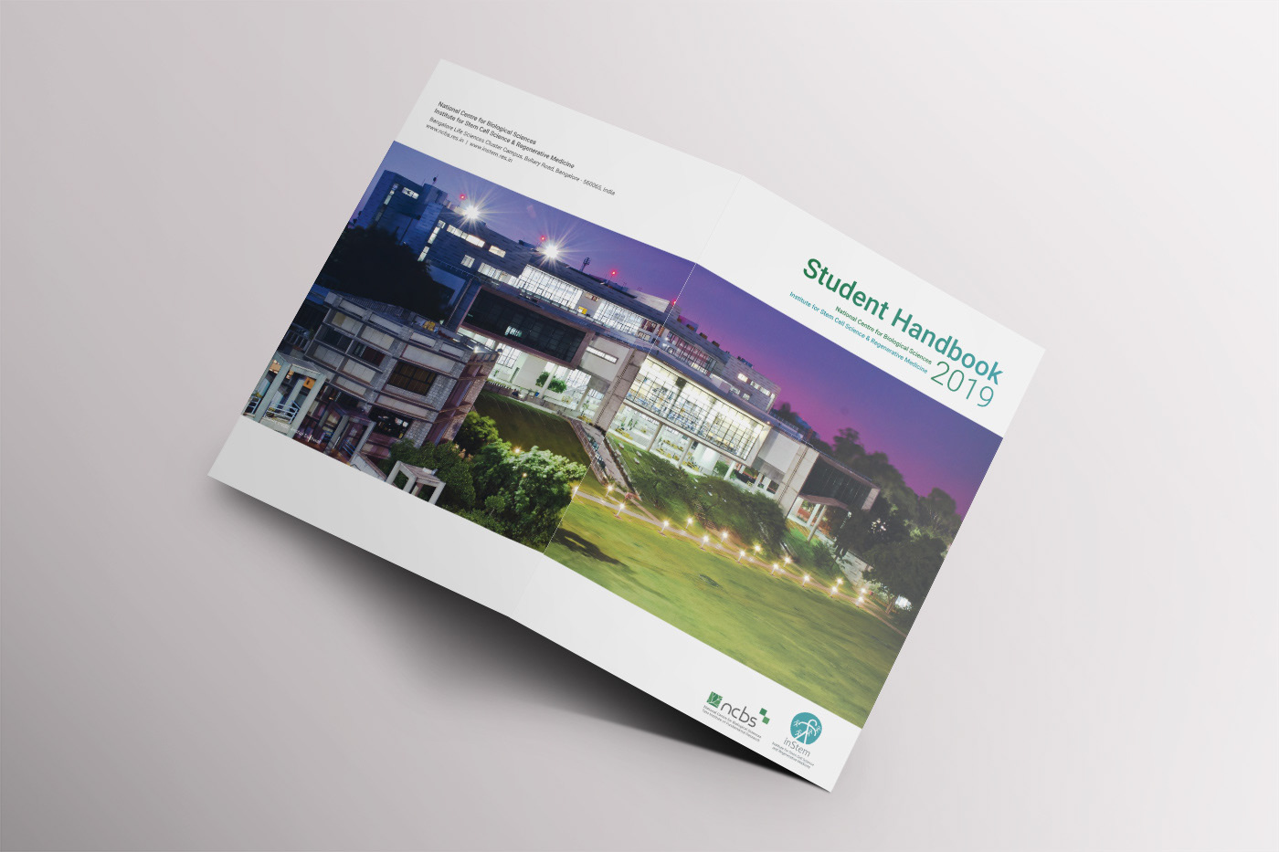
The National Centre for Biological Sciences (NCBS) and the Institute for Stem Cell Science and Regenerative Medicine (inStem) work closely together and even share the core research facilities. Many of the initial communication documents for new students carry both the NCBS & inStem logos. Hence, a color palette was developed that merges these two identities without one dominating the other.